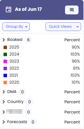
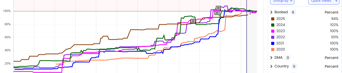
The Forecasting Chart is a visual view of forecasted vs. booked revenue over time. It helps you quickly see where you’re tracking ahead/behind and where to focus next.
By default:
Time Period starts on the current month
Revenue Type starts on Local
A vertical blue line marks today’s date
Turns forecast performance into a quick visual “read” instead of digging through rows.
Helps you spot pacing gaps early enough to take action (rate posture, inventory focus, seller priorities).
Makes alignment easier—everyone can look at the same picture and talk about the same problem.
Sales Principle: Goals don’t get hit by hope—they get hit by visibility + adjustments. This chart helps you make the adjustment sooner.
Open Forecasting Chart.
Use the vertical blue line as your “today marker” to see what should already be booked versus what’s still ahead.
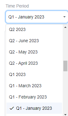
Use the Time Period selector to view a specific month or quarter.
Your selection updates the chart automatically.
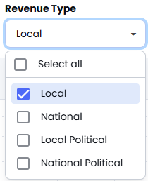
Open Revenue Type.
Select one type—or click multiple checkboxes to combine revenue types.
Click outside the selector to refresh the view.
View (Chart Duration): Quickly zoom in/out to a specific time range without scrolling around the chart.
Reset Zoom: If you zoom in too far, reset back to the full view.
Points: Turn data points on/off (points are off by default).
Percent / Dollars: Toggle between percent mode and booked revenue dollars mode.
Check or uncheck items in the legend to control which lines/data you want displayed on the chart.
Visually track forecasted vs. booked revenue using the Forecast Chart to spot pacing issues early and adjust strategy to meet goals.